Fountain of Dreams
A retro travel poster inviting the viewer to step into the whimsical and colorful land of The Fountain of Dreams, a location based off of Nintendo's Kirby franchise!
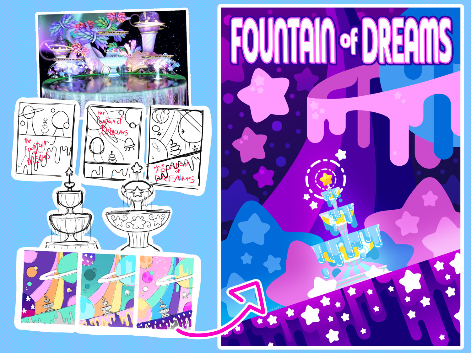
I want to show my step by step process, starting from gathering references, all the way to the final product
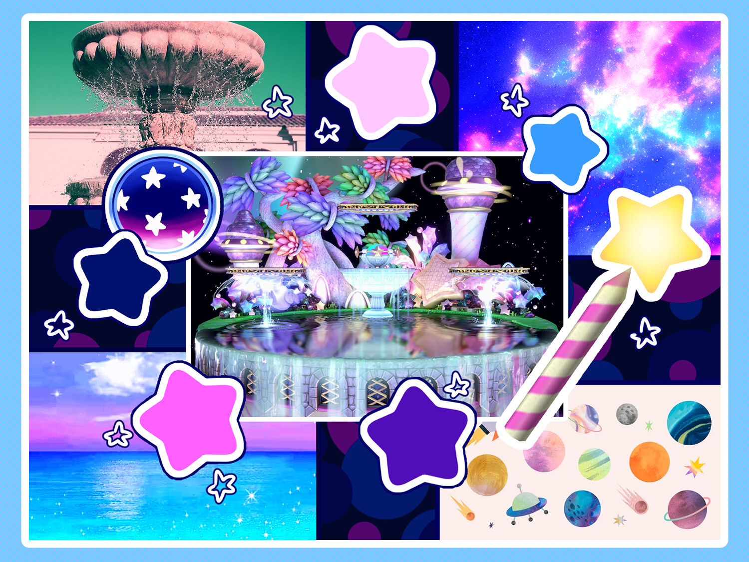
The first thing I wanted to do was figure out the vibe of the piece. I knew I wanted it to be bold and bright. In the Kirby games, space is whatever the game wants it to be. It can be scary and dark, or it can be colorful and exciting!

Next I needed to figure out the layout. I knew I wanted the Fountain to share space with, well, space! I was going to go with Option 4! I also sketched out a few versions of the Fountain itself.

I badly wanted to fit some kind of mint green into the piece, but settled on light blue. Eventually, even that gets replaced. My goal was to make sure the colors popped, but I also wanted to make sure the viewer had somewhere to rest their eyes.

I wanted the text to be simple and bubble, but not too rounded. I eventually settled on "Madurai".

After picking the font, I edited it to better fit my vision. I elongated it, rounded some of the corners, and tweaked the R and S

I made a separate asset for the fountain, and even thought I didn't end up using it in the end, I made a UFO as well.
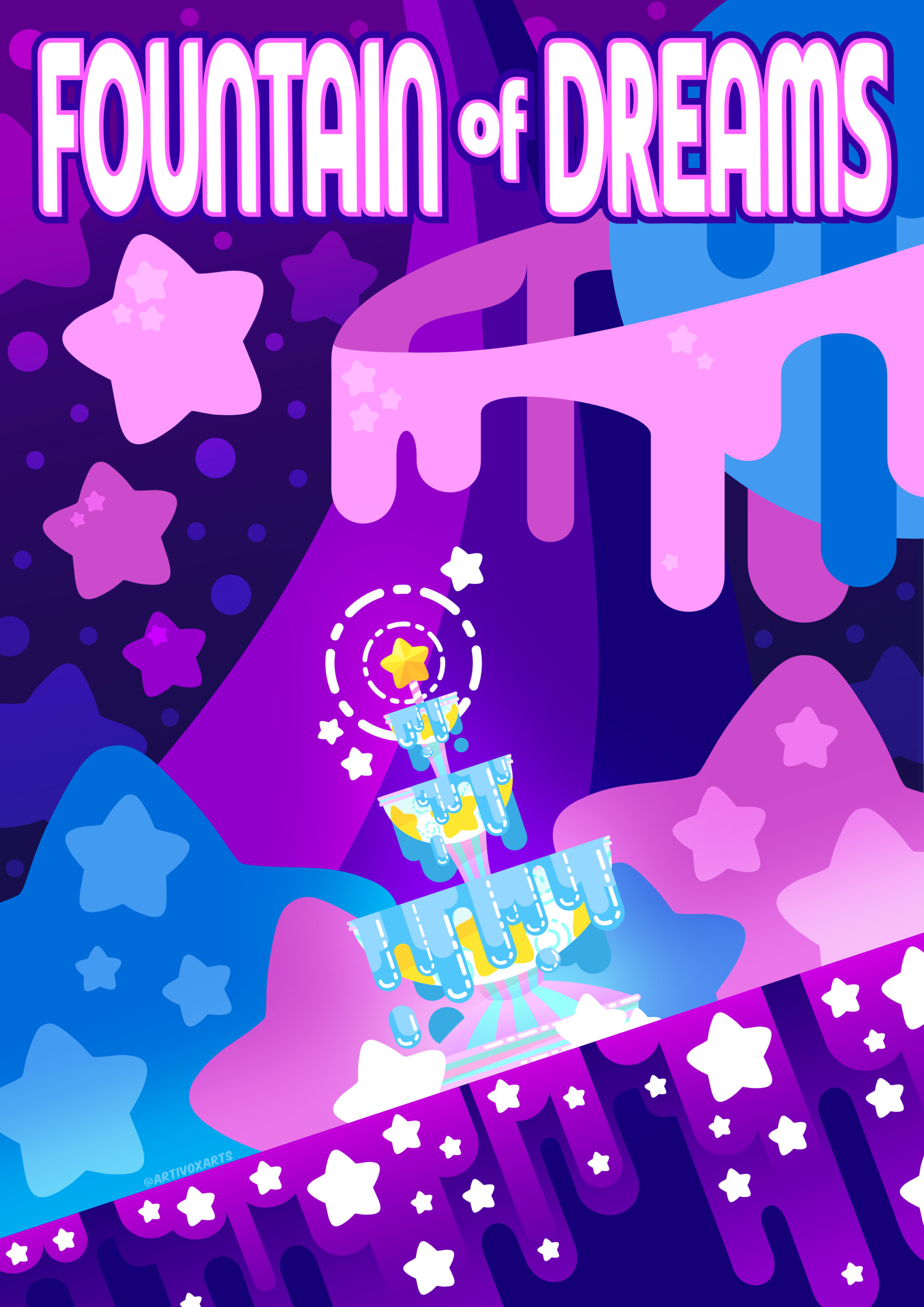
As you can see, during the process itself the image went through a few more changes! I like to use the thumbs as VERY loose ideas, but give myself freedom to explore as I work.